
Casero Taqueria Menu & Marketing Rebrand
Elevating Homemade & Handcrafted in Carlsbad, CA
Objective
In 2022, our objective for this rebrand was to provide an elevated experience for guests. The menu and marketing material had to reflect that new elevated experience. While the launch was successful in communicating the new elevated experience, it was not popular among guests.
After about a year with the elevated menu, ownership asked for an updated menu to reflect the restaurant’s change back to a relaxed and casual environment with casual food.
Below is the path that Hinna (at the time, Meryl) went on to develop the elevated version of Casero Taqueria that ownership wanted, and how she brought some of the concepts and visuals to the more casual version of Casero a year later.
Scope
• Menu Design
• Menu Consultation
• Brand Development
• Brand Identity
• Voice Development
• Social Media audit
• Social Media strategy and implementation
• Voice Development
• Photography execution
• Storytelling

Casero’s Brand Identity Development
After discussing the founding of Casero, the original intent of the restaurant, and the path the brand took since its opening, with ownership, Meryl was able to characterize the new direction into the following character points.
It was great for the team to recalibrate the restaurant’s identity and allowed everyone to get on the same page regarding the restaurant’s identity moving forward.

HANDCRAFTED PREPARATION AND ATMOSPHERE
Every aspect of Casero’s dishes and atmosphere is handcrafted. Casero translated is “of the home/heart”. Combining these elements in words such as “homemade” and visuals of home and heart are key in executing these values.
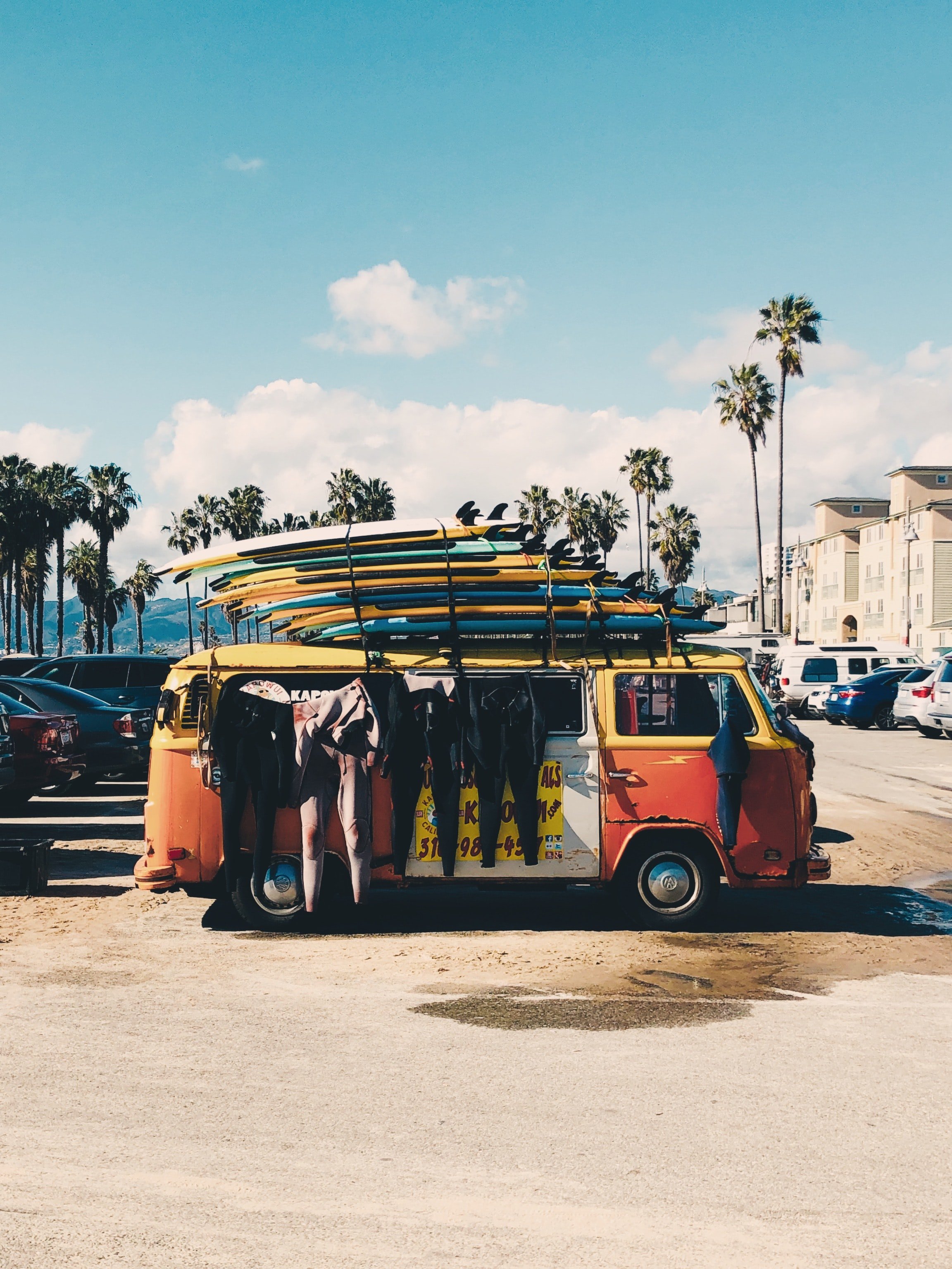
CALIFORNIA TO BAJA ROADTRIP
Casero was made to tell the story of local Californians heading to Baja to surf. There should be references to roadtrips, travel, surfing, and street food in the brand visuals and voice.
TWIST ON TRADITION
Casero is a twist from tradition, it is not serving authentic Mexican or Californian cuisines, but rather a mix of the two. Blending trendy Californian and traditional Baja visuals should be used to show our blending of the cultures.


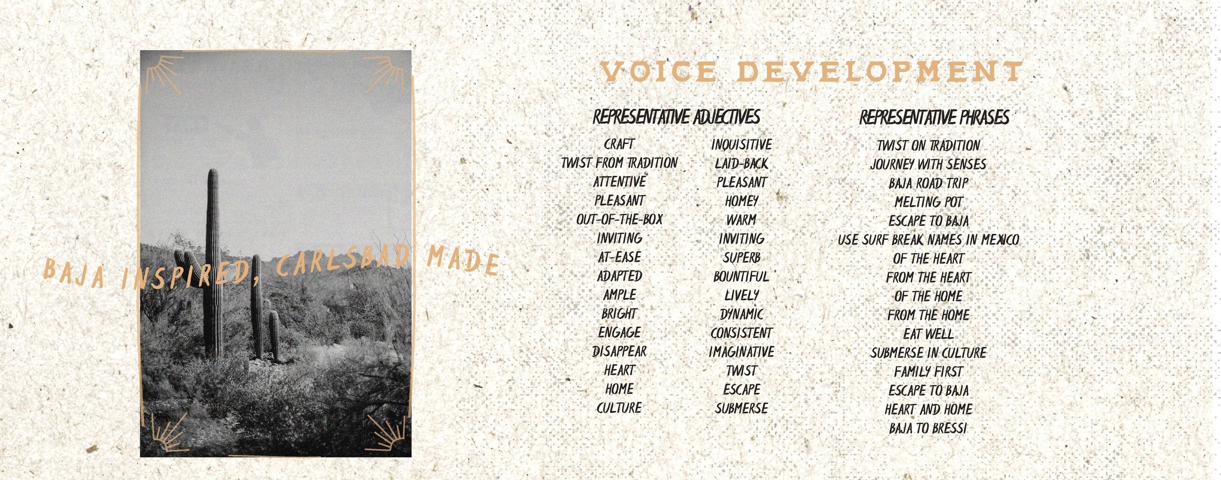
Social Media and Voice Development
Meryl performed the following analysis to correctly gauge the direction for the next phase of Casero Taqueria’s social media presence and voice.
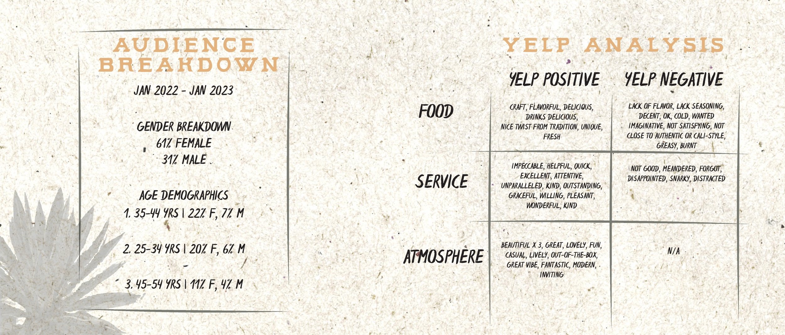
• Audience Breakdown
• Successful post analysis
• Unsuccessful post analysis
• Emotions we want guests to feel while dining
• Yelp keyword analysis
• Representative Adjectives
• Non-representative Adjectives

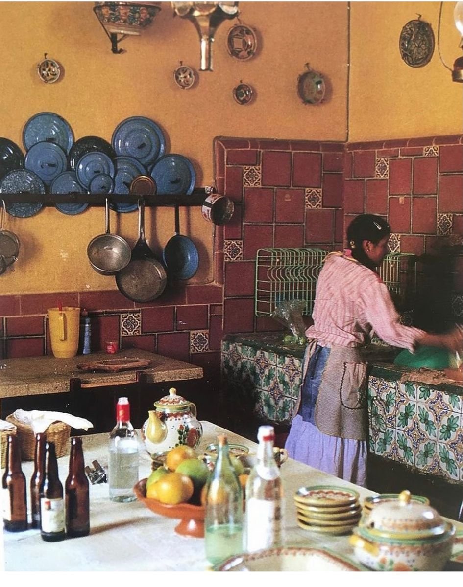
ASSETS
These assets were chosen to promote this new version of Casero: hand-crafted with an emphasis of California and Mexico. Many of them were developed further when the menu / rebrand went more casual.
These assets convey a sense of relaxation with organic lines and shapes to convey a sense of thoughtfulness.
The subjects are classic aspects of SoCal and Mexico, just like Casero. They are made to be highlights, fill empty spaces, or act as a border around our messaging or marketing materials.

COLORS
The gold and black were chosen as the the primary colors for the brand to promote an elevated look.
The secondary colors are representative of the Sonoran desert. Additionally, they were also chosen to balance out the primary colors so there is a mix of elevation, yet a sense of being relaxed and trendy.

TYPOGRAPHY

Palo Santo is a uniquely hand drawn typeface inspired by old Southwestern and Mexican hand lettering, designed by James Coffman.
This font was chosen as the display and title typefaces for its unique characteristics and gives the brand a rich character. Monsterrat was an original typeface from Casero’s founding and is a part of the original logo.
It also brings a familiarity and modernity to communications due to its clarity and scalability. It is versatile with a wide range of weights and styles.


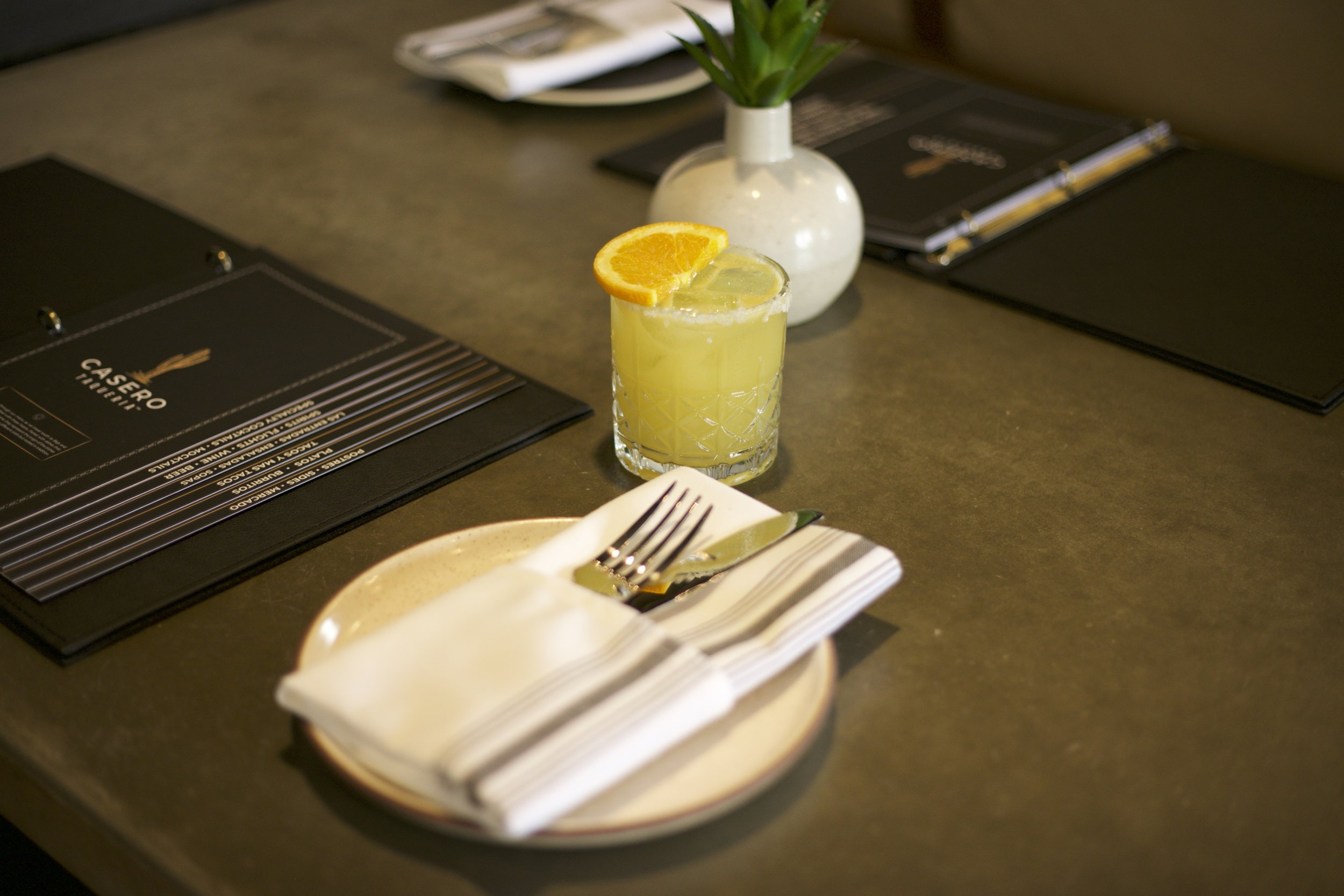
Photography Developement
While planning the menu, the team decided that the photography used in the high end menu would tell a story of the road-trip to Baja that the Owners based Casero on. This would be a series of rotating color and black and white photos, some vintage and some modern. This was the base for all photography used to build the Casero lifestyle.
The photography style was to be dark and moody so the color of the food would pop. This would allow us to promote the quality of ingredients, and visually capture our guests attention.
Textures

These textures express the warmth and hand-crafted characteristics that we were trying to promote within Casero.
These are to be used together or separately, and often. They are meant to be included in marketing materials such as social posts, emails, print materials, etc.

SOCIAL DESIGN
PHOTOGRAPHY FORWARD POSTS:
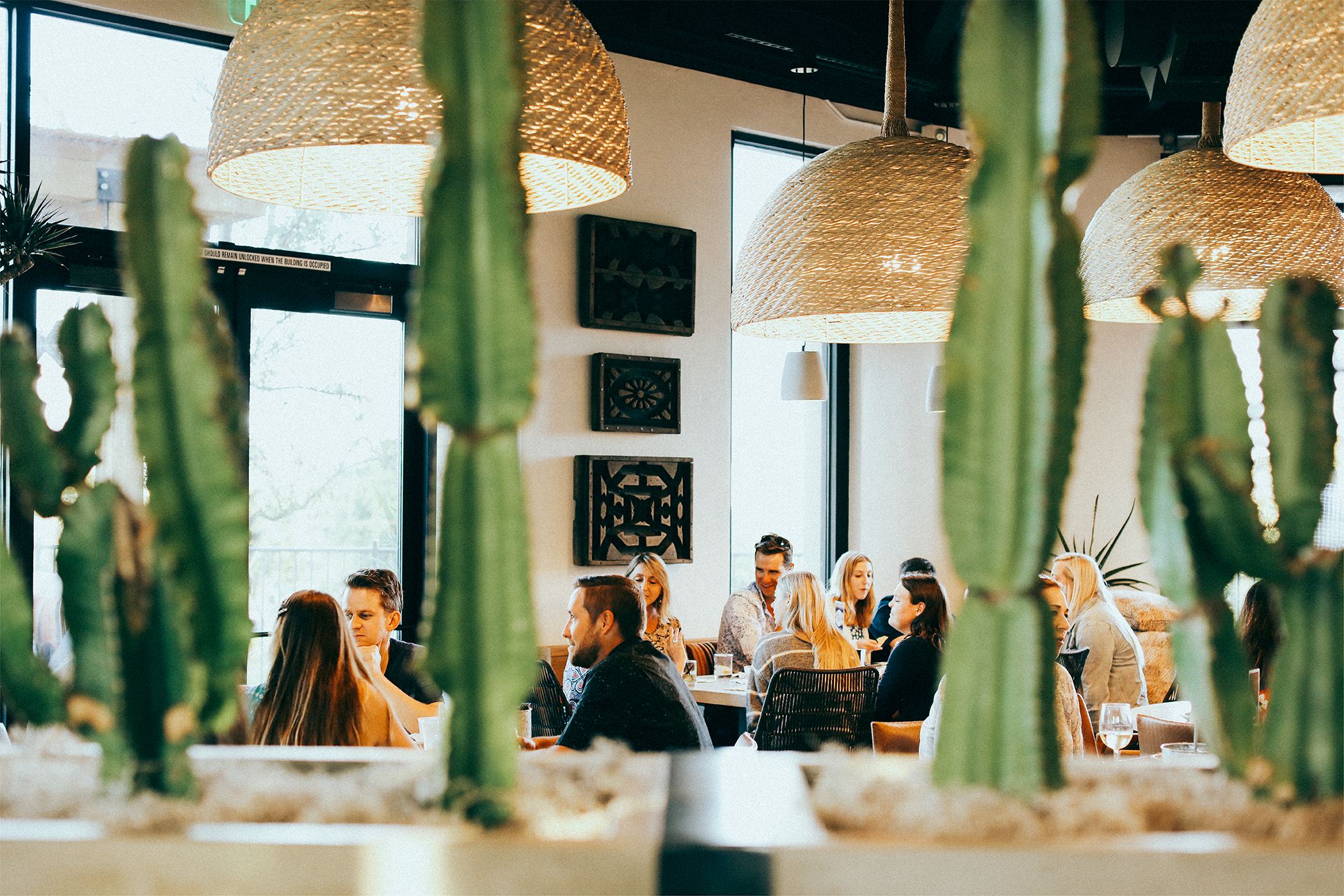
Again, we delibritily wanted moody and dark posts that let the food pop for the elevated version of the brand. As we began to relax the brand image a bit more, the photography also went the way of of bright, colorful, clear photography. It was also important that the photos tell the story of Casero’s atmosphere as it is a beautiful, comfortable, and engaging space, and gives a bit of depth to the brands visuals.
DESIGN FORWARD POSTS:
The chosen photography was to be used for these posts. This included a mix of black and white and color photography, the local geography, photos that epitomize “California cool”, and blend that with the design assets that have been chosen to promote the message.

Website
Meryl and the marketing team creatively directed the restaurant’s website to ensure brand consistency.